Solar cycle map
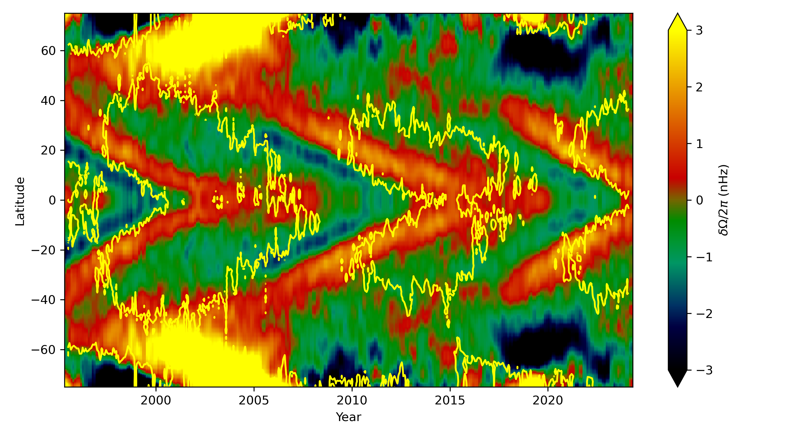
This map shows which latitudes on the Sun were rotating faster (shown in red and yellow) or slower (shown in blue and green) than average over the last 29 years, as inferred by helioseismology (the analysis of solar sound waves). For each solar cycle, there is a band of faster rotation that moves down towards the equator. The yellow lines show the areas where the magnetic fields are most concentrated.
Rachel Howe
Licence type